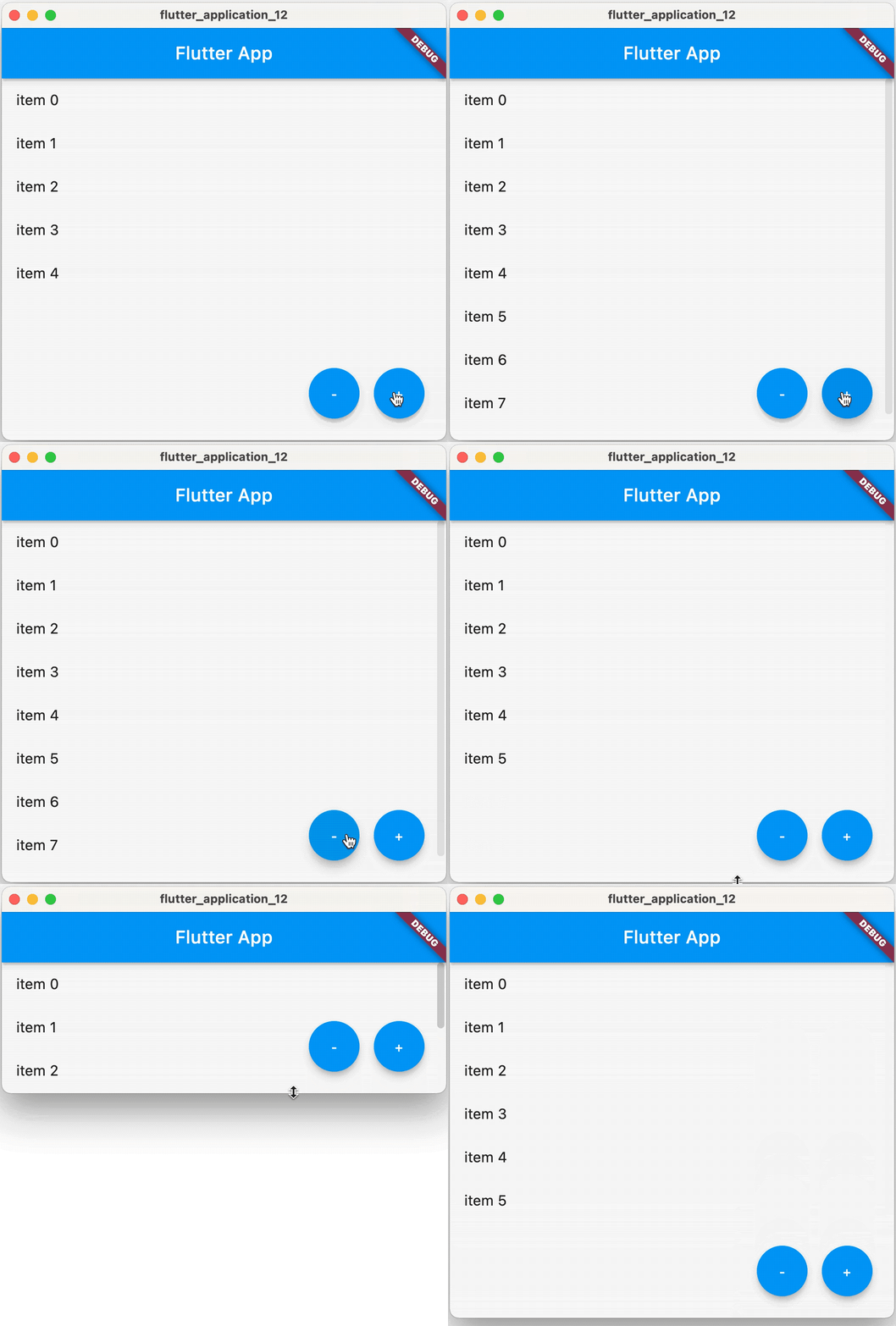
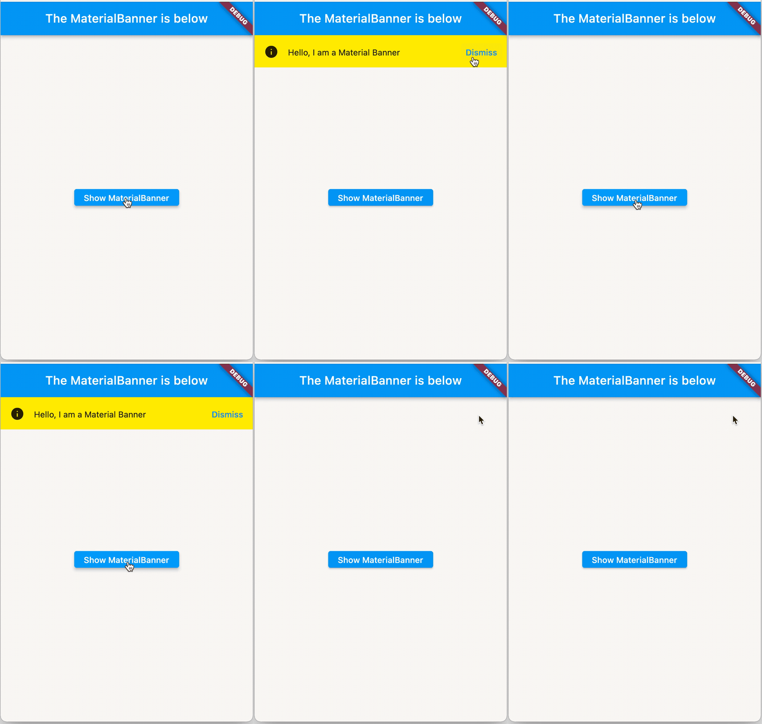
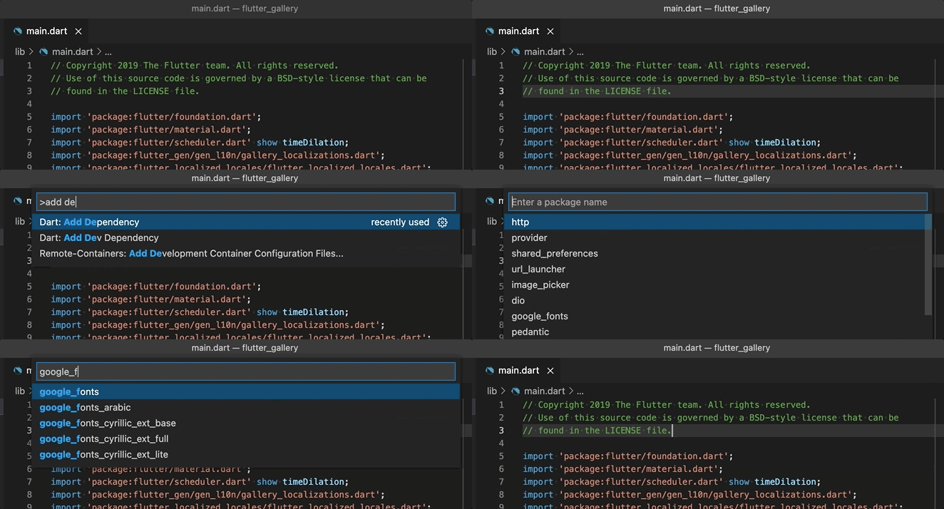
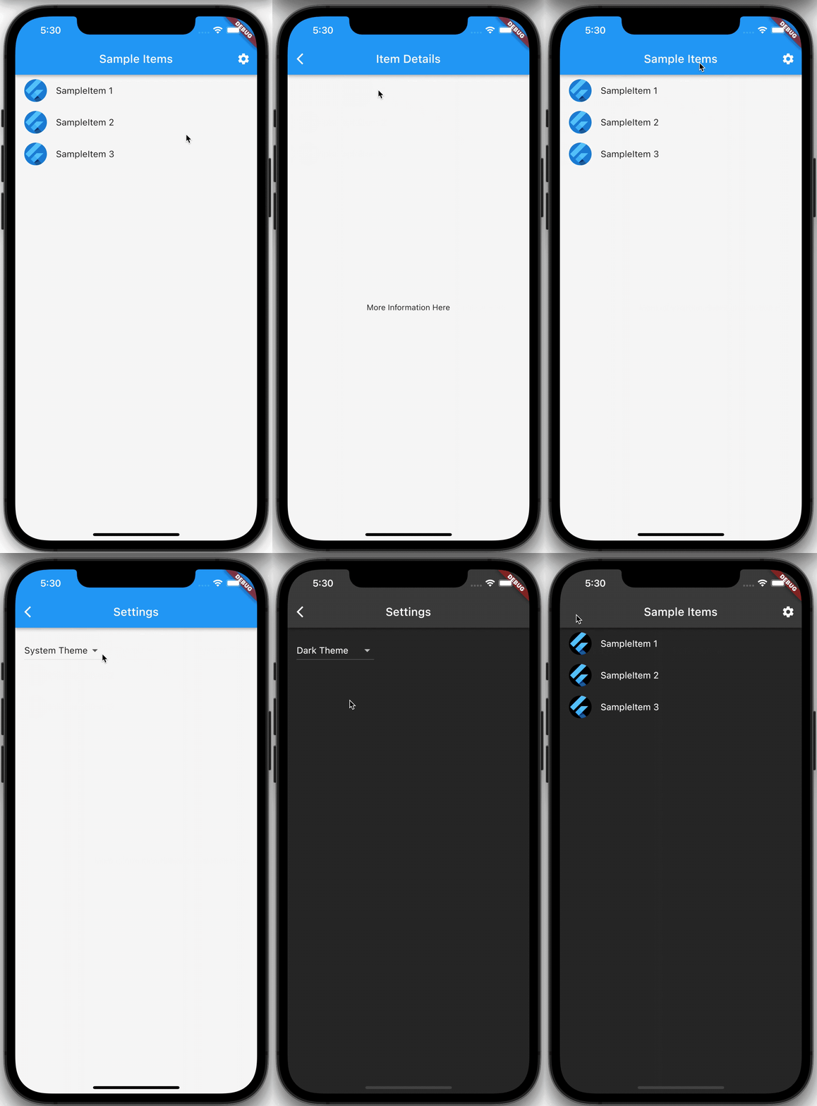
Google search engine
Home Blog Page 18

Explore AnimatedBuilder Widget In Flutter

0

I will utilize Animated Builder Widget. If you are uninformed of this, Animated Builder Widget allude to this archive here. You will presently require two additional widgets on the off chance that you need to implement animations utilizing this widget.

Animation Controller Widget — mainly characterizes the duration of the animation.

Animation Widget — mainly characterizes the type of animation and animation style

In straightforward terms, we utilize these two widgets to characterize and deal with our animations. Ensure you are trying these animations in a Stateful Widget. Additionally, remember to include SingleTickerProviderStateMixin in the class definition. This deals with our animation time.

In this article, we will Explore AnimatedBuilder Widget In Flutter. We will also implement a demo program of AnimatedBuilder Widget and how to use it in your flutter applications.

Table Of Contents::

What is AnimatedBuilder Widget?

Constructor

Properties

Code Implement

Code File

Conclusion


What is AnimatedBuilder Widget?:

AnimatedBuilder Widget is a universally useful widget for building animations. AnimatedBuilder Widget is helpful for more complex widgets that wish to incorporate animation as a component of a larger build function. To utilize AnimatedBuilder, just develop the widget and pass it a builder function.

AnimatedBuilder, a widget that utilizes a builder callback to reconstruct at whatever point a given Listenable triggers its notifications. This widget is regularly utilized with Animation subclasses, henceforth its name, however, is in no way restricted to animations, as it very well may be utilized with any Listenable. It is a subclass of AnimatedWidget, which can be utilized to make widgets that are driven from a Listenable.

To get a more understanding through the help of video , Please watch:

Constructor:

To utilize AnimatedBuilder, you need to call the constructor underneath:

AnimatedBuilder({
Key? key,
required Listenable animation,
required this.builder,
this.child,
})

There are two-argument fields marked with required must not be empty.

Properties:

  • > Key: This property is used to represent how one widget should replace another widget in a tree.
  • > builder: This property is used to call whenever animation changes its value.
  • > animation: This property is utilized to animation is an item that keeps a list of listeners. The listeners are regularly used to notify clients that the item has been updated.
  • > child: This property is utilized as the widget to pass to the builder. On the off chance that a builder callback’s return esteem contains a subtree that doesn’t rely upon the animation, it’s more proficient to assemble that subtree once as opposed to revamping it on each animation tick. If the pre-constructed subtree is passed as the child boundary, the AnimatedBuilder will pass it back to the builder function so it tends to be used in the build. Utilizing this pre-assembled child is altogether discretionary, however can further develop execution essentially sometimes and is, thusly, a decent practice.

There are two variants of this interface:

  • > ValueListenable, an interface that augments the Listenable interface with the concept of current value.
  • > Animation, an interface that augments the ValueListenable interface to add the concept of direction forward or reverse direction.

How to implement code in dart file :

You need to implement it in your code respectively:

Create a new dart file called main.dart inside the lib folder.

We will create a Stateful widget and the respective State class has to use SingleTickerProviderStateMixin.

class _AnimatedBuilderDemoState extends State<AnimatedBuilderDemo>
with SingleTickerProviderStateMixin {
}

To make the progress, we need to make a case of AnimationController and inside the StatefulWidget.

AnimationController _controller;

In initState() method, we will add _controller ie equal to the AnimationController(). Inside AnimationController, we will add duration will be 8seconds. Also, we will add vsyn, value, and repeat.

@override
void initState() {
super.initState();
_controller = AnimationController(
duration: const Duration(seconds: 8),
vsync: this,
)..repeat();
}

In the body, we will add AnimatedBuilder() widget. In this widget, we will add an animation means an object that maintains a list of listeners. We will add _controller variable. It’s child property, we will add a Container widget. Inside the widget, we will add height, widget, and an image.

AnimatedBuilder(
animation: _controller,
child: Container(
width: 300.0,
height: 200.0,
child: Image.asset("assets/logo.png"),
),
builder: (BuildContext context, Widget child) {
return Transform.rotate(
angle: _controller.value * 2.2 * math.pi,
child: child,
);
},
),

In AnimatedBuilder() widget, we will also add builder means call whenever animation changes its value. We will pass two parameters in the bracket that was BuildContext contextWidget child. We will return a Transform.rotate() widget. In this widget, we will add angle means that give the rotation clockwise. We will add _controller.value * 2.2 * math.pi. Also, add a child. When we run the application, we ought to get the screen’s output like the underneath screen video.

Code Files:

import 'package:flutter/material.dart';
import 'dart:math' as math;

import 'package:flutter_animated_builder_demo/splash_screen.dart';

void main() {
runApp(MyApp());
}

class MyApp extends StatelessWidget {
@override
Widget build(BuildContext context) {
return MaterialApp(
debugShowCheckedModeBanner: false,
home: Splash(),
);
}
}

class AnimatedBuilderDemo extends StatefulWidget {
@override
_AnimatedBuilderDemoState createState() => _AnimatedBuilderDemoState();
}

class _AnimatedBuilderDemoState extends State<AnimatedBuilderDemo>
with SingleTickerProviderStateMixin {

AnimationController _controller;

@override
void initState() {
super.initState();
_controller = AnimationController(
duration: const Duration(seconds: 8),
vsync: this,
)..repeat();
}

@override
void dispose() {
_controller.dispose();
super.dispose();
}

@override
Widget build(BuildContext context) {
return Scaffold(
appBar: AppBar(
backgroundColor: Colors.cyan,
automaticallyImplyLeading: false,
title: Text("Flutter AnimatedBuilder Widget Demo"),
),
body: Center(
child: AnimatedBuilder(
animation: _controller,
child: Container(
width: 300.0,
height: 200.0,
child: Image.asset("assets/logo.png"),
),
builder: (BuildContext context, Widget child) {
return Transform.rotate(
angle: _controller.value * 2.2 * math.pi,
child: child,
);
},
),
),
);
}
}

Conclusion:

In the article, I have explained the basic structure of the AnimatedBuilder Widget in a flutter; you can modify this code according to your choice. This was a small introduction to AnimatedBuilder Widget On User Interaction from my side, and it’s working using Flutter.

I hope this blog will provide you with sufficient information on Trying up the AnimatedBuilder Widget in your flutter projects. We will show you what the AnimatedBuilder Widget is?. Show a constructor and properties of the AnimatedBuilder Widget. Make a demo program for working AnimatedBuilder Widget in your flutter applications So please try it.

❤ ❤ Thanks for reading this article ❤❤

If I got something wrong? Let me know in the comments. I would love to improve.

Clap 👏 If this article helps you.


From Our Parent Company Aeologic

Aeologic Technologies is a leading AI-driven digital transformation company in India, helping businesses unlock growth with AI automation, IoT solutions, and custom web & mobile app development. We also specialize in AIDC solutions and technical manpower augmentation, offering end-to-end support from strategy and design to deployment and optimization.

Trusted across industries like manufacturing, healthcare, logistics, BFSI, and smart cities, Aeologic combines innovation with deep industry expertise to deliver future-ready solutions.

Feel free to connect with us:
And read more articles from FlutterDevs.com.

FlutterDevs team of Flutter developers to build high-quality and functionally-rich apps. Hire a flutter developer for your cross-platform Flutter mobile app project on an hourly or full-time basis as per your requirement! You can connect with us on FacebookGitHubTwitter, and LinkedIn for any flutter-related queries.

We welcome feedback and hope that you share what you’re working on using #FlutterDevs. We truly enjoy seeing how you use Flutter to build beautiful, interactive web experiences.


Show/Hide Widget In Flutter

0

It has a visible property that oversees whether the child is remembered for the widget subtree or not. At the point when it is set to false, the replacement child for the most part a zero-sized box has incorporated all things being equal.

In this blog, we will explore the Show/Hide Widget In Flutter. We will see how to implement a demo program and we will see how we can change the visibility of widgets and how to show or hide widgets in Flutter using Visibility Widget in your flutter applications.

Visibility class – widgets library – Dart API
Whether to show or hide a child. By default, the visible property controls whether the child is included in the subtree…api. flutter.dev

Table Of Contents::

Introduction

Constructor

Properties

Code Implement

Code File

Conclusion


Introduction:

Here and there, you might need to make a widget possibly displayed in specific conditions and hidden if the condition doesn’t meet. In Flutter, it tends to be done effectively utilizing Visibility a widget.

The widget you need to show or hide must be the child of Visibility widget. In the constructor, pass visibility alternative whose value is a boolean and is put away as the state. Then, at that point, update the value to show or hide the child.

Demo Module :


Constructor:

To utilize Visibility, you need to call the constructor underneath:

const Visibility({
Key? key,
required this.child,
this.replacement = const SizedBox.shrink(),
this.visible = true,
this.maintainState = false,
this.maintainAnimation = false,
this.maintainSize = false,
this.maintainSemantics = false,
this.maintainInteractivity = false,
})

There is one contention you need to pass, child . child is the show or hide, as controlled by visible.

Properties:

There are some properties of Visibility are:

  • > child: This property is used to the widget that will be shown or hidden depending on visibility value.
  • > maintainAnimation: This property is used to whether to maintain the child‘s animations if it becomes not visible. Default is false.
  • > visible: This property is used to control whether the child is shown or not. Default is true.
  • > replacement: This property is used to the widget that will be shown if the child is not visible. Default is SizedBox.shrink.
  • > maintainState: This property is used whether to maintain the child‘s state if it becomes not visible. Default is false.
  • > maintainInteractivity: This property is used whether to allow the widget to be interactive when hidden. Default is false.
  • > maintainSemantics: This property is used whether to maintain the semantics for the widget when it is hidden. Default is false.
  • > maintainSize: This property is used whether to maintain space for where the widget would have been. Default is false.

How to implement code in dart file :

You need to implement it in your code respectively:

Create a new dart file called main.dart inside the lib folder.

First, we will create a bool variable that was bool _isVisible is equal to true.

bool _isVisible = true;

We will create a showToast() method. In this method, we will add setState() function. We will add _isVisible is equal to !_isVisible.

void showToast() {
setState(() {
_isVisible = !_isVisible;
});
}

In the body, we will add the Visibility() widget. In this widget, we will add visible which means control whether the child is shown or not. We will add variable _isVisible. It’s child property, we will add an image with height and BoxFit.contain.

Visibility(
visible: _isVisible,
child: Image.asset("assets/logo.png",
height: 300,
fit: BoxFit.contain,
),
),

We will also add Text and ElevatedButton(). In this button, we will add style, onPressed, and text. We will add showToast on the onPressed method.

Text("FlutterDevs is a protruding flutter app development company with an extensive "
"in-house team of 30+ seasoned professionals who know exactly what you need "
"to strengthen your business across various dimensions. With more than 10+ years "
"of experience in mobile applications, we know your needs very well."
,style: TextStyle(fontSize: 20)
),
SizedBox(height: 35,),
ElevatedButton(
style: ElevatedButton.styleFrom(
textStyle: TextStyle(fontSize: 20),
minimumSize: Size.fromHeight(50),
),
onPressed: showToast,
child: Text("Show/Hide")
),

When we run the application, we ought to get the screen’s output like the underneath screen capture.

Output

Code File:

import 'package:flutter/material.dart';
import 'package:flutter_visibility_widget_demo/splash_screen.dart';

void main() => runApp(MyApp());

class MyApp extends StatelessWidget {

@override
Widget build(BuildContext context) {
return MaterialApp(
debugShowCheckedModeBanner: false,
home: Splash(),
);
}
}

class ShowHideDemo extends StatefulWidget {
@override
_ShowHideDemoState createState() {
return _ShowHideDemoState();
}
}

class _ShowHideDemoState extends State {
bool _isVisible = true;

void showToast() {
setState(() {
_isVisible = !_isVisible;
});
}

@override
Widget build(BuildContext context) {
return Scaffold(
appBar: AppBar(
automaticallyImplyLeading: false,
backgroundColor: Colors.cyan,
title: Text('Flutter Show/Hide Widget Demo'),
),
body: Padding(
padding: const EdgeInsets.all(8.0),
child: Column(
children: [
Visibility(
visible: _isVisible,
child: Image.asset("assets/logo.png",
height: 300,
fit: BoxFit.contain,
),
),
Text("FlutterDevs is a protruding flutter app development company with an extensive "
"in-house team of 30+ seasoned professionals who know exactly what you need "
"to strengthen your business across various dimensions. With more than 10+ years "
"of experience in mobile applications, we know your needs very well."
,style: TextStyle(fontSize: 20)
),
SizedBox(height: 35,),
ElevatedButton(
style: ElevatedButton.styleFrom(
textStyle: TextStyle(fontSize: 20),
minimumSize: Size.fromHeight(50),
),
onPressed: showToast,
child: Text("Show/Hide")
),
],
),
),
);
}
}

Conclusion:

In the article, I have explained the basic structure of the Show/Hide Widget in a flutter; you can modify this code according to your choice. This was a small introduction to Show/Hide Widget On User Interaction from my side, and it’s working using Flutter.

I hope this blog will provide you with sufficient information on Trying up the Show/Hide Widget in your flutter projects. We will show you what the Introduction is?. Show a constructor and properties of the Show/Hide Widget. Make a demo program for working Show/Hide Widget using Visibility Widget in your flutter applications. So please try it.

❤ ❤ Thanks for reading this article ❤❤

If I got something wrong? Let me know in the comments. I would love to improve.

Clap 👏 If this article helps you.


From Our Parent Company Aeologic

Aeologic Technologies is a leading AI-driven digital transformation company in India, helping businesses unlock growth with AI automation, IoT solutions, and custom web & mobile app development. We also specialize in AIDC solutions and technical manpower augmentation, offering end-to-end support from strategy and design to deployment and optimization.

Trusted across industries like manufacturing, healthcare, logistics, BFSI, and smart cities, Aeologic combines innovation with deep industry expertise to deliver future-ready solutions.

Feel free to connect with us:
And read more articles from FlutterDevs.com.

FlutterDevs team of Flutter developers to build high-quality and functionally-rich apps. Hire a flutter developer for your cross-platform Flutter mobile app project on an hourly or full-time basis as per your requirement! You can connect with us on FacebookGitHubTwitter, and LinkedIn for any flutter-related queries.

We welcome feedback and hope that you share what you’re working on using #FlutterDevs. We truly enjoy seeing how you use Flutter to build beautiful, interactive web experiences.


Explore IntrinsicWidth In Flutter

0

At whatever point you will code for building anything in Flutter, it will be inside a widget. The focal design is to construct the application out of widgets. It depicts how your application view should look with their present configuration and state. At the point when you made any modification in the code, the widget modifies its portrayal by working out the contrast between the past and current widget to decide the insignificant changes for delivering in the UI of the application.

In this blog, we will be Explore IntrinsicWidth In Flutter. We will see how to implement an IntrinsicWidth demo program and show how to use it in your flutter applications.

IntrinsicWidth class – widgets library – Dart API
A widget that sizes its child to the child’s maximum intrinsic width. This class is useful, for example, when unlimited…api. flutter.dev

Table Of Contents::

Introduction

Constructor

Properties

Code Implement

Code File

Conclusion


Introduction:

IntrinsicWidth is a widget that estimates its child to the child’s intrinsic width. It tends to be helpful if the accessible width is limitless, however you need to set the size of a widget to its intrinsic width.

IntrinsicWidth is when limitless width is free and clients might want a child that would somehow endeavor to expand endlessly to rather estimate itself to a more sensible width.

Constructor:

There are constructor of IntrinsicWidth are:

const IntrinsicWidth({ 
Key key,
this.stepWidth,
this.stepHeight,
Widget child
})

Properties :

There are some properties of IntrinsicWidth are:

  • > key: The widget key, used to control if it should be replaced.
  • > stepWidth: This property will force its child’s width to Multiple of this Value. This value must be null or > 0.0.
  • > stepHeight: This property will set a child’s height to be multiple of this Value. If null or 0.0 the child’s height will not be constrained. Its value must not be negative.
  • > child: This Property represents a widget under the current widget in a tree. Child widgets have only one child. To the user, multiple children users can make use of Column WidgetRow WidgetStack Widget and provide children to that widget.

How to implement code in dart file :

You need to implement it in your code respectively:

Create a new dart file called main.dart inside the lib folder.

We should begin with a model where there is a Column widget with the crossAxisAlignment sets to stretch. It has two Container widgets as its children with the second container are wrapped as the child of an Expanded widget. That implies the height of the second container will be extended to the most maximum space. For the width of the Column, since it utilizes CrossAxisAlignment.stretch, it will likewise be expanded to the most maximum space.

final Widget data = Column(
crossAxisAlignment: CrossAxisAlignment.stretch,
children: [
Container(
width: 200,
height: 100,
color: Colors.cyan,
),
Expanded(
child: Container(
width: 100,
height: 100,
color: Colors.orange,
),
),
],
);

In the body, we will add IntrinsicWidth() widget. In this widget, we will add the only stepWidth is of 300 and add child property as data.

IntrinsicWidth(
stepWidth: 300,
child: data,
),

When we run the application, we ought to get the screen’s output like the underneath screen capture.

Using stepWidth

Then, we will set the stepHeight argument to 300. In the past models where the stepHeight isn’t passed, the height of the child expands to occupy the maximum space. Bypassing the stepWidth argument, the height of the child will be set to a base value that is a multiplication of the stepHeight.

IntrinsicWidth(
stepHeight: 300,
child: data,
),

When we run the application, we ought to get the screen’s output like the underneath screen capture.

Using stepHeight

Utilizing IntrinsicWidth is considered costly due to the need to add a speculative design pass before the final layout phase. Hence, the utilization of IntrinsicWidth ought to be kept away from if conceivable. For the above cases, you can consider utilizing a widget that can be utilized to add limitations to the child, like SizedBox or ConstrainedBox.

Remember that the imperatives applied by IntrinsicWidth the widget should agree with the constraints of the parent. In this way, the child’s width can be not as much as its intrinsic width if the most extreme width limitation from the parent isn’t sufficiently huge. Similarly, the child’s width can be bigger than its inherent width if the base width requirement is bigger than the intrinsic width.

IntrinsicWidth(
stepWidth: 300,
stepHeight: 300,
child: data,
),

When we run the application, we ought to get the screen’s output like the underneath screen capture.

Final Output

Code File:

import 'package:flutter/material.dart';

void main() => runApp(MyApp());

class MyApp extends StatelessWidget {

@override
Widget build(BuildContext context) {
return MaterialApp(
debugShowCheckedModeBanner: false,
home: _IntrinsicWidthDemo(),
);
}
}

class _IntrinsicWidthDemo extends StatelessWidget {

final Widget data = Column(
crossAxisAlignment: CrossAxisAlignment.stretch,
children: [
Container(
width: 200,
height: 100,
color: Colors.cyan,
),
Expanded(
child: Container(
width: 100,
height: 100,
color: Colors.orange,
),
),
],
);

@override
Widget build(BuildContext context) {
return Scaffold(
appBar: AppBar(
backgroundColor: Colors.teal,
title: Text('Flutter IntrinsicWidth Demo'),
),
body: IntrinsicWidth(
stepWidth: 300,
stepHeight: 300,
child: data,
),
);
}
}

Conclusion:

In the article, I have explained the basic structure of the IntrinsicWidth widget in a flutter; you can modify this code according to your choice. This was a small introduction to the IntrinsicWidth widget On User Interaction from my side, and it’s working using Flutter.

I hope this blog will provide you with sufficient information on Trying up the IntrinsicWidth in your flutter projects. We will show you what the Introduction is?. Show constructor and properties of the IntrinsicWidth. Make a demo program for working IntrinsicWidth and you can likewise pass stepWidth as well as stepHeight contentions to drive the width and additionally the height of the child to be a multiplication of the given values. So please try it.

❤ ❤ Thanks for reading this article ❤❤

If I got something wrong? Let me know in the comments. I would love to improve.

Clap 👏 If this article helps you.


From Our Parent Company Aeologic

Aeologic Technologies is a leading AI-driven digital transformation company in India, helping businesses unlock growth with AI automation, IoT solutions, and custom web & mobile app development. We also specialize in AIDC solutions and technical manpower augmentation, offering end-to-end support from strategy and design to deployment and optimization.

Trusted across industries like manufacturing, healthcare, logistics, BFSI, and smart cities, Aeologic combines innovation with deep industry expertise to deliver future-ready solutions.

Feel free to connect with us:
And read more articles from FlutterDevs.com.

FlutterDevs team of Flutter developers to build high-quality and functionally-rich apps. Hire a flutter developer for your cross-platform Flutter mobile app project on an hourly or full-time basis as per your requirement! You can connect with us on FacebookGitHubTwitter, and LinkedIn for any flutter-related queries.

We welcome feedback and hope that you share what you’re working on using #FlutterDevs. We truly enjoy seeing how you use Flutter to build beautiful, interactive web experiences.


ScaleTransition Widget In Flutter

0

Animation is an exceptionally incredible and significant idea in Flutter. We can’t envision any mobile application without animations. At the point when you tap on a button or move starting with one page then onto the next page are for the most part animations. Animations upgrade user encounters and make the applications more interactive.

In this article, we will explore the ScaleTransition Widget In Flutter. We will execute a demo program of the scale transition and show you how to create scale transition in your flutter applications.

ScaleTransition class – widgets library – Dart API
Animates the scale of a transformed widget.api.flutter.dev

Table Of Contents::

ScaleTransition Widget

Constructor

Properties

Code Implement

Code File

Conclusion


ScaleTransition Widget:

At times, we might have to show animation when a widget is being shown. Assuming you need it to seem more modest first and afterward it expands steadily, you can utilize ScaleTransition.

This is only the widget that will animate itself while being drawn. It requires the scale parameter to be passed while the other two parameters — alignment and child are discretionary.

Constructor:

To utilize ScaleTransition, you need to call the constructor underneath:

const ScaleTransition({
Key key,
@required Animation<double> scale,
this.alignment = Alignment.center,
this.child,
})

In the Above Constructor, all attributes marked with @required must not be empty.

Properties:

There are some properties of ScaleTransition are:

  • >Key: This property is used to show how one widget should replace another widget in a tree.
  • > Animation<double> scale: This property will be the animation that controls the scale of the child. On the off chance that the current value of the scale animation is v, the child will be painted v times its typical size.
  • > Alignment: This property will characterize the alignment of the beginning of the organized framework in which the scale happens, comparative with the size of the box. For instance, to set the beginning of the scale to the base center, you can utilize an arrangement of (0.0, 1.0).
  • > Child: This property is used to define the widget below this widget in the tree. This widget can only have one child. To layout multiple children, let this widget’s child be a widget such as Row WidgetColumn Widget, or Stack Widget, which have a children’s property, and then provide the children to that widget.

How to implement code in dart file :

You need to implement it in your code respectively:

Create a new dart file called main.dart inside the lib folder.

To make the progress, we need to make a case of AnimationController and Animation<double> inside the StatefulWidget. Remember to utilize it with TickerProviderStateMixin while making Animation in Flutter App.

AnimationController _controller;
Animation<double> _animation;

In initState() method, we will add _controller ie equal to the AnimationController(). Inside AnimationController, we will add duration will be 2 seconds. Also, we will add vsyn, value, and repeat(reverse: true). In this method, we will add _animation is equal to the CurvedAnimation(). Inside, we will add parent and curve.

initState() {
super.initState();
_controller = AnimationController(
duration: const Duration(
seconds: 2,
),
vsync: this,
value: 0.1,
)..repeat(reverse: true);
_animation = CurvedAnimation(
parent: _controller,
curve: Curves.bounceIn,
);
}

We need to dispose of the controller like underneath:

@override
dispose() {
_controller.dispose();
super.dispose();
}

In the body, we will add ScaleTransition() widget. In this widget, we will add scale means animation that controls the scale of the child. We will add _animation variable. We will add alignment as the center. It’s child property, we will add Row() widget. Inside the widget, we will add mainAxisAlignment and crossAxisAlignment was center. Also, we will add an image with height.

ScaleTransition(
scale: _animation,
alignment: Alignment.center,
child: Center(
child: Row(
mainAxisAlignment: MainAxisAlignment.center,
crossAxisAlignment: CrossAxisAlignment.center,
children: [
Image.asset("assets/logo.png",height: 150,),
],
),
),
),

When we run the application, we ought to get the screen’s output like the underneath screen video.

Code File:

import 'package:flutter/material.dart';
import 'package:flutter/animation.dart';
import 'package:flutter_scale_transition_demo/splash_screen.dart';

void main() => runApp(MyApp());

class MyApp extends StatelessWidget {

@override
Widget build(BuildContext context) {
return MaterialApp(
debugShowCheckedModeBanner: false,
home: Splash(),
);
}
}


class ScaleTransitionWidgetDemo extends StatefulWidget {
_ScaleTransitionWidgetDemoState createState() => _ScaleTransitionWidgetDemoState();
}

class _ScaleTransitionWidgetDemoState extends State<ScaleTransitionWidgetDemo>
with TickerProviderStateMixin {
AnimationController _controller;
Animation<double> _animation;

initState() {
super.initState();
_controller = AnimationController(
duration: const Duration(
seconds: 2,
),
vsync: this,
value: 0.1,
)..repeat(reverse: true);
_animation = CurvedAnimation(
parent: _controller,
curve: Curves.bounceIn,
);
}

@override
dispose() {
_controller.dispose();
super.dispose();
}

Widget build(BuildContext context) {
return Scaffold(
appBar: AppBar(
backgroundColor: Colors.teal,
automaticallyImplyLeading: false,
title: Text("Flutter ScaleTransition Widget Demo"),
),
body: Container(
child: ScaleTransition(
scale: _animation,
alignment: Alignment.center,
child: Center(
child: Row(
mainAxisAlignment: MainAxisAlignment.center,
crossAxisAlignment: CrossAxisAlignment.center,
children: [
Image.asset("assets/logo.png",height: 150,),
],
),
),
),
),
);
}
}

Conclusion:

In the article, I have explained the basic structure of the ScaleTransition Widget in a flutter; you can modify this code according to your choice. This was a small introduction toScaleTransition Widget On User Interaction from my side, and it’s working using Flutter.

I hope this blog will provide you with sufficient information on Trying up the ScaleTransition Widget in your flutter projects. We will show you what the ScaleTransition Widget is?. Show a constructor and properties of the ScaleTransition Widget. Make a demo program for working ScaleTransition Widget in your flutter applications So please try it.

❤ ❤ Thanks for reading this article ❤❤

If I got something wrong? Let me know in the comments. I would love to improve.

Clap 👏 If this article helps you.


From Our Parent Company Aeologic

Aeologic Technologies is a leading AI-driven digital transformation company in India, helping businesses unlock growth with AI automation, IoT solutions, and custom web & mobile app development. We also specialize in AIDC solutions and technical manpower augmentation, offering end-to-end support from strategy and design to deployment and optimization.

Trusted across industries like manufacturing, healthcare, logistics, BFSI, and smart cities, Aeologic combines innovation with deep industry expertise to deliver future-ready solutions.

Feel free to connect with us:
And read more articles from FlutterDevs.com.

FlutterDevs team of Flutter developers to build high-quality and functionally-rich apps. Hire a flutter developer for your cross-platform Flutter mobile app project on an hourly or full-time basis as per your requirement! You can connect with us on FacebookGitHubTwitter, and LinkedIn for any flutter-related queries.

We welcome feedback and hope that you share what you’re working on using #FlutterDevs. We truly enjoy seeing how you use Flutter to build beautiful, interactive web experiences.


LongPressDraggable In Flutter

0

A Draggable Widget permits a widget to be dragged, a DragTarget gives an objective to the draggable. A widget that can be dragged from to a DragTarget Widget.

At the point when a draggable widget perceives the beginning of a drag gesture, it shows a feedback widget that tracks the client’s finger across the screen. On the off chance that the user lifts their finger while on top of a DragTarget, that target is offered the chance to accept the data conveyed by the draggable.

In this article, we will explore the LongPressDraggable In Flutter. We will execute a demo program of the LongPressDraggable and how to create a widget that can be dragged beginning from a long press utilizing LongPressDraggable it in your flutter applications.

Table Of Contents::

LongPressDraggable

Constructor

Properties

Code Implement

Code File

Conclusion


LongPressDraggable:

It is utilized to makes a widget that can be dragged beginning from LongPress. On the off chance that you need to make a widget draggable after the client plays out a long press on it, Flutter has a widget for that reason. LongPressDraggable is a widget that permits its child to be dragged beginning from a long press. What you need to do is wrap the draggable widget as the child of the LongPressDraggable widget.

Demo Module :

This demo video shows how to use LongPressDraggable in a flutter. It shows how LongPressDraggable will work in your flutter applications. It tells you the best way to utilize it, including how to set the dragging axis, set the child to show while dragging, add data to the draggable, just as handle events. It will be shown on your device.

Constructor:

To utilize LongPressDraggable, you need to call the constructor underneath:

const LongPressDraggable({
Key? key,
required Widget child,
required Widget feedback,
T? data,
Axis? axis,
Widget? childWhenDragging,
Offset feedbackOffset = Offset.zero,
DragAnchor dragAnchor = DragAnchor.child,
int? maxSimultaneousDrags,
VoidCallback? onDragStarted,
DragUpdateCallback? onDragUpdate,
DraggableCanceledCallback? onDraggableCanceled,
DragEndCallback? onDragEnd,
VoidCallback? onDragCompleted,
this.hapticFeedbackOnStart = true,
bool ignoringFeedbackSemantics = true,
})

There are two contentions you need to pass, child and feedbackchild is the widget that can be dragged beginning from a long press. You likewise need to characterize the widget to be displayed under the pointer during a drag as feedback.

Properties:

There are some properties of LongPressDraggable are:

  • > Key: This property is used to controls how one widget replaces another widget in the tree.
  • > child: This property is used to the widget below this widget is in the tree.
  • > feedback: This property is used to shows the widget to show under the pointer when a drag is underway.
  • > data: This property is used for the data that will be dropped by this draggable.
  • > Axis: This property is used Axis to restrict this draggable’s movement if specified.
  • > childWhenDragging: This property is utilized regarding the widget to show rather than a child when at least one drags are in progress.
  • > feedbackOffset: This property is utilized to set the hit test target point for finding a drags target. Defaults to Offset.zero
  • > dragAnchor: This property is utilized to where this widget should be anchored during a drag.
  • > maxSimultaneousDrags: How many simultaneous drag to support. When null, no limit is applied. Set this to 1 if you want to only allow the drag source to have one item dragged at a time. Set this to 0 if you want to prevent the draggable from actually being dragged.
  • > onDragStarted: This property is called when a drag is started on a widget.
  • > onDraggableCanceled: This property is called when a drag is started on a widget. called when the draggable is dropped without being accepted by a DragTarget Widget.
  • > onDragCompleted: When a draggable is dragged to a DragTarget Widget and accepted, this callback is called. We have a separate article for it. Users can read it from DragTarget Widget.
  • > hapticFeedbackOnStart: Whether haptic feedback should be triggered on drag start.
  • > ignoringFeedbackSemantics: Whether the semantics of the feedback widget is ignored when building the semantics tree.

How to implement code in dart file :

You need to implement it in your code respectively:

Create a new dart file called main.dart inside the lib folder.

First, we will create a variable of Offset that is equal to Offset(100,250). Generally, Offset(dy, dx) will be zero.

Offset _offset = Offset(100,250);

In the body, we will add LayoutBuilder() widget. In this widget, we will add a builder and pass argument context, constraints in the bracket. Then, we will return a Stack() widget. We will add Positioned() widget. Inside we will add left define _offset. dx and top define _offset.dy.

LayoutBuilder(
builder: (context, constraints) {
return Stack(
children: [
Positioned(
left: _offset.dx,
top: _offset.dy,
child: LongPressDraggable(
feedback: Image.asset("assets/logo.png",height: 100,color: Colors.cyan,),
child: Image.asset("assets/logo.png",height: 100,),
onDragEnd: (details) {
setState(() {
final adjustment = MediaQuery.of(context).size.height -
constraints.maxHeight;
_offset = Offset(
details.offset.dx, details.offset.dy - adjustment);
});
},
),
),
],
);
},
),

It’s child property, we will add LongPressDraggable() widget. In this widget, we will add feedback means the widget to show under the pointer when a drag is underway and we will add an image with height and color. Then, add child which means the widget below this widget is in the tree. Also, add onDragEnd means called when the draggable is dropped. We will add setState() method. Inside, we will add final adjustment is equal to height minus max height, and _offset is equal to Offset(details. offset. dx, details.offset.dy — adjustment).

When we run the application, we ought to get the screen’s output like the underneath screen capture.

Output

Code File:

import 'package:flutter/cupertino.dart';
import 'package:flutter/material.dart';
import 'package:flutter/rendering.dart';
import 'package:flutter_longpressdraggable_dem/splash_screen.dart';

void main() => runApp(MyApp());

class MyApp extends StatelessWidget {

@override
Widget build(BuildContext context) {
return MaterialApp(
debugShowCheckedModeBanner: false,
home: Splash(),
);
}
}

class LongPressDraggableDemo extends StatefulWidget {

@override
_LongPressDraggableDemoState createState() => _LongPressDraggableDemoState();
}

class _LongPressDraggableDemoState extends State<LongPressDraggableDemo> {

Offset _offset = Offset(100,250);

@override
Widget build(BuildContext context) {
return Scaffold(
appBar: AppBar(
automaticallyImplyLeading: false,
title: Text('Flutter LongPressDraggable Demo '),
),
body: Center(
child: LayoutBuilder(
builder: (context, constraints) {
return Stack(
children: [
Positioned(
left: _offset.dx,
top: _offset.dy,
child: LongPressDraggable(
feedback: Image.asset("assets/logo.png",height: 100,color: Colors.cyan,),
child: Image.asset("assets/logo.png",height: 100,),
onDragEnd: (details) {
setState(() {
final adjustment = MediaQuery.of(context).size.height -
constraints.maxHeight;
_offset = Offset(
details.offset.dx, details.offset.dy - adjustment);
});
},
),
),
],
);
},
),
),
);
}
}

Conclusion:

In the article, I have explained the basic structure of the LongPressDraggable Widget in a flutter; you can modify this code according to your choice. This was a small introduction to LongPressDraggable On User Interaction from my side, and it’s working using Flutter.

I hope this blog will provide you with sufficient information on Trying up the LongPressDraggable in your flutter projects. We will show you what the LongPressDraggable is?. Show a constructor and properties of the LongPressDraggable. To make a widget draggable after the user plays out a long press, you can wrap it as the child of LongPressDraggable. Thusly, you are likewise needed to characterize a widget to be displayed under the pointer during a drag. You can likewise pass a few callback works that will be considered when certain events happen. So please try it.

❤ ❤ Thanks for reading this article ❤❤

If I got something wrong? Let me know in the comments. I would love to improve.

Clap 👏 If this article helps you.


From Our Parent Company Aeologic

Aeologic Technologies is a leading AI-driven digital transformation company in India, helping businesses unlock growth with AI automation, IoT solutions, and custom web & mobile app development. We also specialize in AIDC solutions and technical manpower augmentation, offering end-to-end support from strategy and design to deployment and optimization.

Trusted across industries like manufacturing, healthcare, logistics, BFSI, and smart cities, Aeologic combines innovation with deep industry expertise to deliver future-ready solutions.

Feel free to connect with us:
And read more articles from FlutterDevs.com.

FlutterDevs team of Flutter developers to build high-quality and functionally-rich apps. Hire a flutter developer for your cross-platform Flutter mobile app project on an hourly or full-time basis as per your requirement! You can connect with us on FacebookGitHubTwitter, and LinkedIn for any flutter-related queries.

We welcome feedback and hope that you share what you’re working on using #FlutterDevs. We truly enjoy seeing how you use Flutter to build beautiful, interactive web experiences.


Explore BlockSemantics In Flutter

0

Flutter permits you to set the semantics of a widget or a subtree by wrapping it as the child of the Semantics widget. A few widgets given by Flutter as of now have semantics as a matter of course. The semantics data given by the application can be extremely valuable for availability services. Accordingly, we should give suitable semantics for the UI showed on the screen. Notwithstanding, at times we need certain pieces of the UI to not have semantics.

In this article, we will Explore BlockSemantics In Flutter. We will execute a demo program of the BlockSemantics and how to use it in your flutter applications.

Table Of Contents::

BlockSemantics

Constructor

Properties

Code Implement

Code File

Conclusion


BlockSemantics:

In such cases, it’s smarter to utilize BlockSemantics, which is a more helpful approach to reject the semantics of sibling widgets. It’s shrewd enough to just do that for widgets that were painted before the BlockSemantics child, which implies that you don’t have to manually figure out which ones ought to, and which shouldn’t be disregarded.

Additionally, you might need that the semantics are just set for specific widgets on a subtree. For instance, when a popup is being shown, it implies the client can just interact with the popup. Different widgets ought not to have semantics at that point.

Demo Module :

This demo video shows how to use BlockSemantics in a flutter. It shows how BlockSemantics will work in your flutter applications. It shows there is a button for showing a popup. The popup itself is made utilizing a Card. When the popup is being shown, the client can just communicate with the popup. At that point, different widgets behind the popup ought not to have semantics, including the ‘Show popup’ button. BlockSemantics widget drops the semantics of all widgets that were painted before it in a similar semantic container. It will be shown on your device.

Constructor:

To utilize BlockSemantics, you need to call the constructor underneath:

const BlockSemantics({
Key key,
this.blocking = true,
Widget child
})

You can utilize BlockSemantics and pass the popup widget as the child contention. The constructor has a named contention blocking which shows whether it should drop the semantics of different widgets painted before it. Thusly, you can pass a state variable to make the value true when the popup is being shown or false something else.

Properties:

There are some properties of BlockSemanticsare:

  • > blocking: This property is used to whether this widget is blocking semantics of all widgets that were painted before it in the same semantic container.
  • key: This property is used to controls how one widget replaces another widget in the tree.
  • > child: This property is utilized to characterize the widget beneath this widget in the tree. This widget can just have one child. To design various children, let this present widget’s child be a widget like Row Widget, Column Widget, or Stack Widget, which have a children’s property, and afterward give the children to that widget.

How to implement code in dart file :

You need to implement it in your code respectively:

Create a new dart file called main.dart inside the lib folder.

First, we will create a bool variable _showMessages is equal to false and static constant textStyle color was red.

bool _showMessage = false;
static const TextStyle textStyle = const TextStyle(color: Colors.red);

In the body, we will add SizedBox with a double width. infinity. We will add the Column widget. In this widget, we will add SizedBox with width and height. We will add the Stack widget. Inside, we will add an OutlinedButton(). We will add text and the onPressed function. In the function, we will add setState() method. Inside, we will add _showMessage is equal to true and wrap OutlinedButton() to Positioned() widget.

SizedBox(
width: double.infinity,
child: Column(
mainAxisAlignment: MainAxisAlignment.center,
children: [
SizedBox(
width: 400,
height: 150,
child: Stack(
alignment: Alignment.topCenter,
children: [
Positioned(
bottom: 0,
child: OutlinedButton(
child: Text('Show Message'),
onPressed: () => setState(() { _showMessage = true; }),
),
),
BlockSemantics(
blocking: _showMessage,
child: Visibility(
visible: _showMessage,
child: _buildMessage(),
),
)
],
),
),
],
),
),

We will add BlockSemantics() widget. Inside, we will add blocking is _showMessage bool variable and Its child property we will add Visibility(). Inside, add visible are equal _showMessage and add a _buildMessage() widget. We will discuss the below code.

We will deeply define _buildMessage() widget are:

In this widget, we will return Card(). Inside, we will add color, SizedBox, and Column. Inside a Column, we will add ListTile(). Inside we will add leading, title, and subtitle. Also, we will add TextButton(). Inside, we will add Text and the onPressed function. In the function, we will add setState() method. Inside, we will add _showMessage is equal to false and wrap TextButton() to ButtonTheme() widget.

Widget _buildMessage() {
return Card(
color: Colors.cyan[50],
child: SizedBox(
width: 200,
child: Column(
mainAxisSize: MainAxisSize.min,
children: <Widget>[
ListTile(
leading: Image.asset("assets/logo.png",height: 22,),
title: Text('BlockSemantics Demo', style: textStyle),
subtitle: Text('by Flutter Devs', style: textStyle),
),
ButtonTheme(
child: ButtonBar(
children: <Widget>[
TextButton(
child: const Text('OK', style: textStyle),
onPressed: () => setState(() { _showMessage = false; }),
),
],
),
),
],
),
),
);
}

When the popup is being displayed and the showSemanticsDebugger is set to true, and we run the application, we ought to get the screen’s output like the underneath screen capture.

Final Output

Code File:

import 'package:flutter/material.dart';
import 'package:flutter/rendering.dart';
import 'package:flutter_block_semantics_demo/splash_screen.dart';

void main() => runApp(MyApp());

class MyApp extends StatelessWidget {

@override
Widget build(BuildContext context) {
return MaterialApp(
showSemanticsDebugger: true,
debugShowCheckedModeBanner: false,
home: Splash(),
);
}
}

class BlockSemanticDemo extends StatefulWidget {

@override
State<StatefulWidget> createState() {
return _BlockSemanticDemoState ();
}
}

class _BlockSemanticDemoState extends State<BlockSemanticDemo> {

bool _showMessage = false;
static const TextStyle textStyle = const TextStyle(color: Colors.red);

Widget _buildMessage() {
return Card(
color: Colors.cyan[50],
child: SizedBox(
width: 200,
child: Column(
mainAxisSize: MainAxisSize.min,
children: <Widget>[
ListTile(
leading: Image.asset("assets/logo.png",height: 22,),
title: Text('BlockSemantics Demo', style: textStyle),
subtitle: Text('by Flutter Devs', style: textStyle),
),
ButtonTheme(
child: ButtonBar(
children: <Widget>[
TextButton(
child: const Text('OK', style: textStyle),
onPressed: () => setState(() { _showMessage = false; }),
),
],
),
),
],
),
),
);
}

@override
Widget build(BuildContext context) {
return Scaffold(
appBar: AppBar(
automaticallyImplyLeading: false,
title: const Text('Flutter BlockSemantics Demo'),
backgroundColor: Colors.cyan,

),
body: SizedBox(
width: double.infinity,
child: Column(
mainAxisAlignment: MainAxisAlignment.center,
children: [
SizedBox(
width: 400,
height: 150,
child: Stack(
alignment: Alignment.topCenter,
children: [
Positioned(
bottom: 0,
child: OutlinedButton(
child: Text('Show Message'),
onPressed: () => setState(() { _showMessage = true; }),
),
),
BlockSemantics(
blocking: _showMessage,
child: Visibility(
visible: _showMessage,
child: _buildMessage(),
),
)
],
),
),
],
),
),
);
}
}

Conclusion:

In the article, I have explained the basic structure of the BlockSemantics Widget in a flutter; you can modify this code according to your choice. This was a small introduction to BlockSemantics On User Interaction from my side, and it’s working using Flutter.

I hope this blog will provide you with sufficient information on Trying up the BlockSemantics in your flutter projects. We will show you what the BlockSemantics is?. Show a constructor and properties of the BlockSemantics. That is how to exclude the semantics of widget subtrees in Flutter. You can utilize BlockSemantics relying upon the case. So please try it.

❤ ❤ Thanks for reading this article ❤❤

If I got something wrong? Let me know in the comments. I would love to improve.

Clap 👏 If this article helps you.


From Our Parent Company Aeologic

Aeologic Technologies is a leading AI-driven digital transformation company in India, helping businesses unlock growth with AI automation, IoT solutions, and custom web & mobile app development. We also specialize in AIDC solutions and technical manpower augmentation, offering end-to-end support from strategy and design to deployment and optimization.

Trusted across industries like manufacturing, healthcare, logistics, BFSI, and smart cities, Aeologic combines innovation with deep industry expertise to deliver future-ready solutions.

Feel free to connect with us:
And read more articles from FlutterDevs.com.

FlutterDevs team of Flutter developers to build high-quality and functionally-rich apps. Hire a flutter developer for your cross-platform Flutter mobile app project on an hourly or full-time basis as per your requirement! You can connect with us on FacebookGitHubTwitter, and LinkedIn for any flutter-related queries.

We welcome feedback and hope that you share what you’re working on using #FlutterDevs. We truly enjoy seeing how you use Flutter to build beautiful, interactive web experiences.


Explore Autocomplete Widget In Flutter

0

Flutter came out a couple of days prior and presents to us an extremely valuable widget called Autocomplete. With this new companion, we presently can rapidly carry out autocomplete text fields without utilizing any outsider party plugins. Making a pursuit field with ideas that show up as the client types something is currently perfect and simple.

In this article, we will Explore Autocomplete Widget In Flutter. We will execute a demo program of the autocomplete and tell you the best way to utilize the widget, including how to set the options, customize the TextField, and handle the choice chose events in your flutter applications.

Autocomplete class – material library – Dart API
A widget for helping the user make a selection by entering some text and choosing from among a list of options. The…api.flutter.dev

Table Of Contents::

Introduction

Constructor

Properties

Code Implement

Code File

Conclusion


Introduction:

On the off chance that you have a text field in your Flutter application, for certain cases, it would be pleasant if you can give a list of choices that clients can choose from. Subsequently, the clients don’t have to type the total text and henceforth can further develop the client experience. In Flutter, that should be possible by utilizing Autocomplete widget. It’s a widget that permits the client to type on text enter and choose over a list of choices.

Demo Module :

This demo video shows how to use autocomplete in a flutter. It shows how to autocomplete will work in your flutter applications. It shows when users tap on textfield then will show down some suggestions and yow will also pick up those suggestions. It will be shown on your device.

Constructor:

To utilize Autocomplete, you need to call the constructor underneath:

const Autocomplete({
Key? key,
required AutocompleteOptionsBuilder<T> optionsBuilder,
AutocompleteOptionToString<T> displayStringForOption = RawAutocomplete.defaultStringForOption,
AutocompleteFieldViewBuilder fieldViewBuilder =
_defaultFieldViewBuilder,
AutocompleteOnSelected<T>? onSelected,
AutocompleteOptionsBuilder<T>? optionsViewBuilder,
})

The Autocomplete class itself has a generic kind T expands Object. That implies the choice item can be any kind of object, not a string.

Properties:

There are some properties of Autocompleteare:

  • > key: The widget’s key, used to control how a widget is replaced with another widget.
  • > optionsBuilder: Returns the selectable options objects given the current TextEditingValue.
  • > displayStringForOption: Returns the string to be shown for choice.
  • > fieldViewBuilder: Used to construct the field whose info is utilized to get the alternatives. If not given, will construct a standard Material-style text field by default.
  • > onSelected: A function that will be considered when a choice is chosen by the user.
  • > optionsViewBuilder: Used to assemble the selectable options widgets from a list of choices objects.

How to implement code in dart file :

You need to implement it in your code respectively:

Create a new dart file called country_page.dart inside the lib folder.

To start with, we will make a class name Country to be utilized as the choice item.

class Country {

const Country({
required this.name,
required this.size,
});

final String name;
final int size;

@override
String toString() {
return '$name ($size)';
}
}

Create a new dart file called main.dart inside the lib folder.

const List<Country> countryOptions = <Country>[
Country(name: 'Africa', size: 30370000),
Country(name: 'Asia', size: 44579000),
Country(name: 'Australia', size: 8600000),
Country(name: 'Bulgaria', size: 110879),
Country(name: 'Canada', size: 9984670),
Country(name: 'Denmark', size: 42916),
Country(name: 'Europe', size: 10180000),
Country(name: 'India', size: 3287263),
Country(name: 'North America', size: 24709000),
Country(name: 'South America', size: 17840000),
];

When calling the constructor, you need to pass Country as the generic type.

Autocomplete<Country>(
// Put the arguments here
)

There is a necessarily named contention optionsBuilder. For that contention, you need to pass a function that returns the list of options that can be chosen by the user. The following are instances of how to make the options builder and pass different contentions upheld by Flutter’s Autocomplete widget.

  • > Set Options Builder:

You can handle the list of choices accessible to browse by making your own AutocompleteOptionsBuilder and pass it as optionsBuilder. The AutocompleteOptionsBuilder is a function that acknowledges a boundary of type TextEditingValue and returns an Iterable of T. By using the passed TextEditingValue, you can filter the list of options to be shown depending on the current text.

optionsBuilder: (TextEditingValue textEditingValue) {
return countryOptions
.where((Country county) => county.name.toLowerCase()
.startsWith(textEditingValue.text.toLowerCase())
)
.toList();
},
  • > Set Displayed String Options:

Of course, Flutter will utilize the toString method for the generic kind as the shown string for every choice, as you can see from the past output. Be that as it may, it’s feasible to set the string to be shown by passing displayStringForOption contention. You need to pass a function that acknowledges a boundary of type T and returns the string that you need to show in the options.

In the code beneath, the function passed as displayStringForOption returns the name property of the Country class.

displayStringForOption: (Country option) => option.name,
  • > Set Field View Builder:

For the text field, Flutter will construct a standard Material-style text field of default. Assuming you need to utilize an altered TextView, you can pass fieldViewBuilder contention. The value for the contention is a function with four boundaries whose types all together are BuildContext, TextEditingController, FocusNode, and VoidCallback. The return kind of the function is a Widget.

The underneath model passes the fieldViewBuilder contention with the passed work returns a TextField with a custom text style.:

fieldViewBuilder: (
BuildContext context,
TextEditingController fieldTextEditingController,
FocusNode fieldFocusNode,
VoidCallback onFieldSubmitted
) {
return TextField(
controller: fieldTextEditingController,
focusNode: fieldFocusNode,
style: const TextStyle(fontWeight: FontWeight.bold),
);
},
  • > Set Options View Builder:

The function should have three boundaries whose types all together are BuildContextAutocompleteOnSelected<T>, and Iterable<T>. The subsequent boundary is the function to be considered when a thing is chosen, while the third boundary is the list of options. The return kind of the function is a Widget.

Generally, you need to utilize the passed options to assemble a list of widgets. Likewise, the Autocomplete widget should be advised when the client chooses an option. To tell the Autocomplete widget, call the AutocompleteOnSelected function and pass the selected item as the contention.

The beneath model makes a custom view for the options by making a ListView wrapped as the child of a Container. Each list item is wrapped as the child of a GestureDetector widget, settling on it conceivable to decision the AutocompleteOnSelected function when a tap gesture happens.

optionsViewBuilder: (
BuildContext context,
AutocompleteOnSelected<Country> onSelected,
Iterable<Country> options
) {
return Align(
alignment: Alignment.topLeft,
child: Material(
child: Container(
width: 300,
color: Colors.cyan,
child: ListView.builder(
padding: EdgeInsets.all(10.0),
itemCount: options.length,
itemBuilder: (BuildContext context, int index) {
final Country option = options.elementAt(index);

return GestureDetector(
onTap: () {
onSelected(option);
},
child: ListTile(
title: Text(option.name, style: const TextStyle(color: Colors.white)),
),
);
},
),
),
),
);
},
  • > Set On Selected Callback:

At the point when the client chooses an item from the options, you can get the event by passing a callback function as onSelected contention. The callback function acknowledges a boundary of type T and returns void.

onSelected: (Country selection) {
print('Selected: ${selection.name}');
},

When we run the application, we ought to get the screen’s output like the underneath screen capture.

Final Output

Code File:

import 'package:flutter/material.dart';
import 'package:flutter_autocomplete_demo/country_page.dart';
import 'package:flutter_autocomplete_demo/splash_screen.dart';

void main() => runApp(MyApp());

class MyApp extends StatelessWidget {

@override
Widget build(BuildContext context) {
return MaterialApp(
debugShowCheckedModeBanner: false,
home: Splash(),
);
}
}


const List<Country> countryOptions = <Country>[
Country(name: 'Africa', size: 30370000),
Country(name: 'Asia', size: 44579000),
Country(name: 'Australia', size: 8600000),
Country(name: 'Bulgaria', size: 110879),
Country(name: 'Canada', size: 9984670),
Country(name: 'Denmark', size: 42916),
Country(name: 'Europe', size: 10180000),
Country(name: 'India', size: 3287263),
Country(name: 'North America', size: 24709000),
Country(name: 'South America', size: 17840000),
];

class AutoCompleteDemo extends StatefulWidget {

@override
State<StatefulWidget> createState() => _AutoCompleteDemoState();
}

class _AutoCompleteDemoState extends State<AutoCompleteDemo> {

@override
Widget build(BuildContext context) {
return Scaffold(
appBar: AppBar(
automaticallyImplyLeading: false,
title:Text('Flutter AutoComplete Demo'),
backgroundColor: Colors.cyan,
),
body: Padding(
padding: EdgeInsets.all(15.0),
child: Autocomplete<Country>(
optionsBuilder: (TextEditingValue textEditingValue) {
return countryOptions
.where((Country county) => county.name.toLowerCase()
.startsWith(textEditingValue.text.toLowerCase())
)
.toList();
},
displayStringForOption: (Country option) => option.name,
fieldViewBuilder: (
BuildContext context,
TextEditingController fieldTextEditingController,
FocusNode fieldFocusNode,
VoidCallback onFieldSubmitted
) {
return TextField(
controller: fieldTextEditingController,
focusNode: fieldFocusNode,
style: const TextStyle(fontWeight: FontWeight.bold),
);
},
onSelected: (Country selection) {
print('Selected: ${selection.name}');
},
optionsViewBuilder: (
BuildContext context,
AutocompleteOnSelected<Country> onSelected,
Iterable<Country> options
) {
return Align(
alignment: Alignment.topLeft,
child: Material(
child: Container(
width: 300,
color: Colors.cyan,
child: ListView.builder(
padding: EdgeInsets.all(10.0),
itemCount: options.length,
itemBuilder: (BuildContext context, int index) {
final Country option = options.elementAt(index);

return GestureDetector(
onTap: () {
onSelected(option);
},
child: ListTile(
title: Text(option.name, style: const TextStyle(color: Colors.white)),
),
);
},
),
),
),
);
},
),
),
);
}
}

Conclusion:

In the article, I have explained the basic structure of the Autocomplete Widget in a flutter; you can modify this code according to your choice. This was a small introduction to Autocomplete Widget On User Interaction from my side, and it’s working using Flutter.

I hope this blog will provide you with sufficient information on Trying up the Autocomplete Widget in your flutter projects. We will show you what the Introduction is?. Show a constructor and properties of the Autocomplete Widget. The AutoComplete widget can be utilized to give a superior user experience to the users by permitting them to choose from a list of qualities. On the off chance that is essential, you can likewise generate the choices dynamically (for example from API response) rather than utilizing static choices like in this article. You can likewise consider utilizing RawAutocomplete which permits you to pass FocusNode and TextEditingController as contentions when utilizing an external field. So please try it.

❤ ❤ Thanks for reading this article ❤❤

If I got something wrong? Let me know in the comments. I would love to improve.

Clap 👏 If this article helps you.

find the source code of the Flutter Autocomplete Widget Demo:

GitHub – flutter-devs/flutter_autocomplete_widget_demo
A new Flutter application. This project is a starting point for a Flutter application. A few resources to get you…github.com


From Our Parent Company Aeologic

Aeologic Technologies is a leading AI-driven digital transformation company in India, helping businesses unlock growth with AI automation, IoT solutions, and custom web & mobile app development. We also specialize in AIDC solutions and technical manpower augmentation, offering end-to-end support from strategy and design to deployment and optimization.

Trusted across industries like manufacturing, healthcare, logistics, BFSI, and smart cities, Aeologic combines innovation with deep industry expertise to deliver future-ready solutions.

Feel free to connect with us:
And read more articles from FlutterDevs.com.

FlutterDevs team of Flutter developers to build high-quality and functionally-rich apps. Hire a flutter developer for your cross-platform Flutter mobile app project on an hourly or full-time basis as per your requirement! You can connect with us on FacebookGitHubTwitter, and LinkedIn for any flutter-related queries.

We welcome feedback and hope that you share what you’re working on using #FlutterDevs. We truly enjoy seeing how you use Flutter to build beautiful, interactive web experiences.


Explore FutureBuilder In Flutter

0

In Dart, you can make a function that returns Future if you need to perform asynchronous activities. Some of the time, you might need to build a Flutter widget that relies upon the consequence of a Future. All things considered, you can utilize FutureBuilder. FutureBuilder is a widget that utilizes the result of a Future to build itself. The following are instances of how to utilize the widget.

In this blog, we will be Explore FutureBuilder In Flutter. We will also implement a demo program and we show you how to use FutureBuilder in your flutter applications.

Table Of Contents::

Introduction

Constructor

Parameters

Code Implement

Code File

Conclusion


Introducton:

In Flutter, the FutureBuilder Widget is utilized to make widgets dependent on the most recent snapshot of association with a Future. Future needs to be gotten before either through a difference in state or change in dependencies. FutureBuilder is a Widget that will assist you with executing some asynchronous function and based on that function’s outcome your UI will update.

In future builder, it calls the future capacity to wait for the outcome, and when it creates the outcome it calls the builder function where we assemble the widget.

Constructor:

To utilize FutureBuilder, you need to call the constructor underneath:

const FutureBuilder({
Key? key,
Future<T>? future,
T? initialData,
required AsyncWidgetBuilder<T> builder,
})

The FutureBuilder class has a conventional parameter which is the information type to be returned by the Future. To utilize it, you need to call the constructor which can be seen previously. Fundamentally, what you need to do is construct a widget utilizing a capacity passed as the builder the contention, because of the snapshot of a Future, passed as the future argument.

Parameters:

There are some parameters of FutureBuilderare:

  • Key? key: The widget’s key, used to control how a widget is replaced with another widget.
  • Future<T>? future: A Future whose snapshot can be accessed by the builder function.
  • T? initialData: The data that will be used to create the snapshots until a non-null Future has completed.
  • required AsyncWidgetBuilder<T> builder: The build strategy used by this builder.

How to implement code in dart file :

You need to implement it in your code respectively:

Let’s create a Future:

To start with, we need to make a Future to be passed as the future argument. In this article, we will utilize the capacity beneath, which returns Future<String>

Future<String> getValue() async {
await Future.delayed(Duration(seconds: 3));
return 'Flutter Devs';
}

You should be cautious when passing the Future. In the event that you pass it as the code underneath.

FutureBuilder(
future: getValue(),
// other arguments
),

The getValue function will be considered each time the widget is reconstructed. If you don’t need the function to be considered each time the widget is revamped, you should not make the Future inside State.build or StatelessWidget.build technique. TheFuture should be made before, for instance during State.initStateState.didChangeDependencies, or State.daidUpdateWidget. In the model underneath, the Future is put away in a state variable.

Future<String> _value;

@override
initState() {
super.initState();
_value = getValue();
}

Then, at that point, pass the state variable as the future argument.

FutureBuilder<String>(
future: _value(),
// other arguments
),

Let’s create a AsyncWidgetBuilder

You are needed to pass an AsyncWidgetBuilder function that is utilized to assemble the widget. The function has two boundaries. The main boundary’s sort is BuildContext, while the subsequent boundary’s sort is AsyncSnapshot<T>. You can utilize the value of the subsequent boundary to decide the substance that ought to be delivered.

In the first place, you need to comprehend about AsyncSnapshot. AsyncSnapshot is portrayed as a changeless portrayal of the latest interaction with an asynchronous calculation. For this situation, it addresses the most recent communication with a Future. There are some significant properties AsyncSnapshot that can be helpful. The first is connectionState whose type is ConnectionState enum. It shows the current association state to an asynchronous calculation. In the FutureBuilder’s degree, the asynchronous calculation is the Future.

FutureBuilder<String>(
future: _value,
builder: (
BuildContext context,
AsyncSnapshot<String> snapshot,
) {
if (snapshot.connectionState == ConnectionState.waiting) {
return CircularProgressIndicator();
} else if (snapshot.connectionState == ConnectionState.done) {
if (snapshot.hasError) {
return const Text('Error');
} else if (snapshot.hasData) {
return Text(
snapshot.data,
style: const TextStyle(color: Colors.cyan, fontSize: 36)
);
} else {
return const Text('Empty data');
}
} else {
return Text('State: ${snapshot.connectionState}');
}
},
),

The enum has some possible values:

  • > none: Not connected to any asynchronous computation. It can happen if the future is null.
  • > waiting: Associated with asynchronous calculation and awaiting communication. In this specific situation, it implies the Future hasn’t been finished.
  • > active: Associated with a functioning asynchronous calculation. For instance, if a Stream has returned any value yet is not finished at this point. Ought not to occur for FutureBuilder.
  • > done: Associated with an ended asynchronous calculation. In this unique circumstance, it implies the Future has finished.

Another property you need to know is hasError. It tends to be utilized to show whether the depiction contains a non-null error value. If the last consequence of the asynchronous activity was fizzled, the value will be valid. To check whether the snapshot contains non-null information, you can utilize the hasData property.

The asynchronous activity must be finished with non-null information altogether for the value to turn out to be valid. Nonetheless, if the asynchronous activity finishes without information (for example Future<void>), the value will be false. If the snapshot has data, you can acquire it by getting to the data property.

Because of the value of the properties above, you can figure out what ought to be delivered on the screen. In the code over, a CircularProgressIndicator is shown when the connectionState value is waiting. At the point when the connectionState changes to done, you can check whether the snapshot has an error or data.

Let set the Initial Data:

The constructor of FutureBuilder has a named parameter initialData. It very well may be utilized to pass the data that will be utilized to make the snapshots until a non-null Future has finished. Passing a value as the initialData makes the hasData property have true value toward the start, even before the Future finishes.

You can get to the initial data utilizing the data property. When the Future has finished with a non-invalid value, the value of data will be supplanted with another worth returned by the Future. If the Future finishes with an error, the hasData and data properties will be refreshed to false and invalid individually.

FutureBuilder<String>(
initialData: 'Demo Name'
// other arguments
),

By setting an initial data, the snapshot can have information in any event, when the connection state is as yet waiting. In this manner, we need to change the code above inside the if (snapshot.connectionState == ConnectionState.waiting) block, with the goal that the initial data can be shown when the association state is waiting.

if (snapshot.connectionState == ConnectionState.waiting) {
return Column(
crossAxisAlignment: CrossAxisAlignment.center,
mainAxisAlignment: MainAxisAlignment.center,
children: [
CircularProgressIndicator(),
Visibility(
visible: snapshot.hasData,
child: Text(
snapshot.data,
style: const TextStyle(color: Colors.black, fontSize: 24),
),
)
],
);
}

When we run the application, we ought to get the screen’s output like the underneath screen video.

Code File:

import 'package:flutter/material.dart';
import 'package:flutter_futurebuilder_demo/splash_screen.dart';

void main() => runApp(MyApp());

class MyApp extends StatelessWidget {

@override
Widget build(BuildContext context) {
return MaterialApp(
home: Splash(),
debugShowCheckedModeBanner: false,
);
}
}

Future<String> getValue() async {
await Future.delayed(Duration(seconds: 3));
return 'Flutter Devs';
}

class FutureBuilderDemo extends StatefulWidget {
@override
State<StatefulWidget> createState() {
return _FutureBuilderDemoState ();
}
}

class _FutureBuilderDemoState extends State<FutureBuilderDemo> {

Future<String> _value;

@override
initState() {
super.initState();
_value = getValue();
}

@override
Widget build(BuildContext context) {
return Scaffold(
appBar: AppBar(
automaticallyImplyLeading: false,
backgroundColor: Colors.black,
title: const Text('Flutter FutureBuilder Demo'),
),
body: SizedBox(
width: double.infinity,
child: Center(
child: FutureBuilder<String>(
future: _value,
initialData: 'Demo Name',
builder: (
BuildContext context,
AsyncSnapshot<String> snapshot,
) {
if (snapshot.connectionState == ConnectionState.waiting) {
return Column(
crossAxisAlignment: CrossAxisAlignment.center,
mainAxisAlignment: MainAxisAlignment.center,
children: [
CircularProgressIndicator(),
Visibility(
visible: snapshot.hasData,
child: Text(
snapshot.data,
style: const TextStyle(color: Colors.black, fontSize: 24),
),
)
],
);
} else if (snapshot.connectionState == ConnectionState.done) {
if (snapshot.hasError) {
return const Text('Error');
} else if (snapshot.hasData) {
return Text(
snapshot.data,
style: const TextStyle(color: Colors.cyan, fontSize: 36)
);
} else {
return const Text('Empty data');
}
} else {
return Text('State: ${snapshot.connectionState}');
}
},
),
),
),
);
}
}

Conclusion:

In the article, I have explained the basic structure of the FutureBuilder in a flutter; you can modify this code according to your choice. This was a small introduction to FutureBuilder On User Interaction from my side, and it’s working using Flutter.

I hope this blog will provide you with sufficient information on Trying up the FutureBuilder in your flutter projects. We will show you what the Introduction is?. Show a constructor and parameters of Streambuilder. That is the way to utilize FutureBuilder in Flutter. You need to make a Future and pass it as the future argument. The snapshots of the Future will be passed to the builder function, in which you can decide the format to be shown depending on the current snapshot. So please try it.

❤ ❤ Thanks for reading this article ❤❤

If I got something wrong? Let me know in the comments. I would love to improve.

Clap 👏 If this article helps you.


From Our Parent Company Aeologic

Aeologic Technologies is a leading AI-driven digital transformation company in India, helping businesses unlock growth with AI automation, IoT solutions, and custom web & mobile app development. We also specialize in AIDC solutions and technical manpower augmentation, offering end-to-end support from strategy and design to deployment and optimization.

Trusted across industries like manufacturing, healthcare, logistics, BFSI, and smart cities, Aeologic combines innovation with deep industry expertise to deliver future-ready solutions.

Feel free to connect with us:
And read more articles from FlutterDevs.com.

FlutterDevs team of Flutter developers to build high-quality and functionally-rich apps. Hire a flutter developer for your cross-platform Flutter mobile app project on an hourly or full-time basis as per your requirement! You can connect with us on FacebookGitHubTwitter, and LinkedIn for any flutter-related queries.

We welcome feedback and hope that you share what you’re working on using #FlutterDevs. We truly enjoy seeing how you use Flutter to build beautiful, interactive web experiences.


Flutter 2.5 — What’s New In Flutter

0

Google, the search giant recently rolled out the new stable version of its Extensive Popular Cross-Platform UI Framework Flutter. Flutter 2.5 is out with 4600 closed issues and 3932 merged PRs.

Flutter 2.5 & Dart 2.14 have been released at the same time with evidently Substantial Performance Improvements from their contemporary releases. Flutter is release proceeds with a few significant performance and tooling improvements to find performance issues in your own application.

Simultaneously, there are a few new provisions, including full-screen support for Android, more Material You support, updated text editing to help switchable keyboard shortcuts, a new, more definite look at your widgets in the Widget Inspector, new help for adding dependencies in your Visual Studio Code projects, new help for getting inclusion data from your test runs in IntelliJ/Android Studio and a totally different application layout to fill in as a superior establishment for your genuine Flutter applications.


Some of the Key Announcements In Release are ::>

Performance Improvements:

This release accompanies a few performance enhancements. iOS has less jank, burns-through less CPU and power, wiping out jank from this source in our testing, and is more performant now. Additionally, iOS 8 help is deprecated

Frame lag due to processing asynchronous event results before and after

One more reason for jank is the point at which the garbage collector (GC)pauses the UI thread to recover memory. In this release, memory for unused pictures is recovered excitedly, reducing GCs extensively.

GCs before and after adding the fix to eagerly reclaim unused large image memory

One more performance improvement in Flutter 2.5 is the latency when sending messages among Dart and Objective-C/Swift (iOS) or Dart and Java/Kotlin (Android). Eliminating pointless duplicates from messaging codecs diminished latencies by up to half contingent upon message size and device.

iOS message latencies before and after

Dart 2.14:

This release of Flutter comes with Dart 2.14

  • > Apple Silicon support
  • > Dart formatter and cascades
  • > Pub support for ignoring files using.pubignore
  • > Pub is much smarter and faster
  • Flutter Lints is out of the box now.
  • > added a new triple shift operator (>>>)

Breaking changes

  • > Removed support for ECMAScript5
  • > Deprecated dartfmt and dart2native commands, and discontinued stagehand
  • > Deprecated the Dart VM’s Native Extensions

If you want to explore more about Flutter, please visit Announcing Dart 2.14 to get more information.

Announcing Dart 2.14
Apple Silicon support, and improved productivity with default lints, better tools, and new language featuresmedium.com

Framework:

The Flutter 2.5 release includes several fixes and improvements to the framework.

  • > Android full-screen support

Android, has fixed a bunch of related issues around full-screen modes. New features: lean back, sticky, sticky immersive, and edge to edge. This change additionally added an approach to listen to fullscreen changes in different modes.

Normal mode (left), Edge to Edge mode (center), Edge to Edge with a custom SystemUIOverlayStyle (right)
  • > Floating action button sizes updated

As part of Material You, users can configure a larger FloatingActionButton if they choose. With this change a FAB can be configured in 4 sizes: small, regular, large, and extended.

New Material You FAB sizes
  • > MaterialState.scrolledUnder state added to SliverAppBar

Demo::

SliverAppBar(
backwardsCompatibility: false,
elevation: 0,
backgroundColor: MaterialStateColor.resolveWith((Set<MaterialState> states) {
return states.contains(MaterialState.scrolledUnder) ? Colors.indigo : Colors.blue;
}),
expandedHeight: 160,
pinned: true,
flexibleSpace: const FlexibleSpaceBar(
title: Text('SliverAppBar'),
),
),
MaterialState.scrolledUnder action
  • > ListView now sends notifications of scrollable areas even if the user isn’t scrolling
scrollbar appearing or disappearing as appropriate based on the underlying size of the ListView
  • > Material banner supports now to the ScaffoldMessenger

In Flutter 2.5, you would now be able to add a banner to the highest point of your scaffold that stays set up until the user dismisses it.

ElevatedButton(
child: const Text('Show MaterialBanner'),
onPressed: () => ScaffoldMessenger.of(context).showMaterialBanner(
MaterialBanner(
content: const Text('Hello, I am a Material Banner'),
leading: const Icon(Icons.info),
backgroundColor: Colors.yellow,
actions: [
TextButton(
child: const Text('Dismiss'),
onPressed: () => ScaffoldMessenger.of(context)
.hideCurrentMaterialBanner(),
),
],
),
),
)

Camera: show some features are –

  • 3795 [camera] android-rework part 1: Base classes to support Android Camera features
  • 3796 [camera] android-rework part 2: Android autofocus feature
  • 3797 [camera] android-rework part 3: Android exposure-related features
  • 3798 [camera] android-rework part 4: Android flash and zoom features
  • 3799 [camera] android-rework part 5: Android FPS range, resolution, and sensor orientation features

Image Picker:

  • 3898 [image_picker] Image picker fix camera device
  • 3956 [image_picker] Change storage location for camera captures to internal cache on Android, to comply with new Google Play storage requirements
  • 4001 [image_picker] Removed redundant request for camera permission
  • 4019 [image_picker] Fix rotation when the camera is a source
  • > battery package moved to battery_plus

Besides, since these plugins are at this point not effectively kept up with, they are as of now not set apart as Flutter Favorite plugins. If you haven’t effectively done as such, we prescribe moving to the in addition to renditions of the accompanying plugins:

Flutter DevTools:

This release of Flutter comes with several improvements to Flutter DevTools. First and foremost is the added support in DevTools to take advantage of engine updates.

  • > Flutter DevTools utilizes these events to assist you with diagnosing shader compilation jank in your application
  • > New CPU Profiler highlight that empowers you to hide profiler data from any of these sources.
  • > Now we can easily distinguish codes with colored bars so that you can easily see what parts of the CPU Frame Chart come from what parts of the system.
  • > This release of DevTools accompanies an update to the Widget Inspector that permits you to hover over a widget to assess the object, view properties, widget state, etc.

When you select a widget, it consequently populates in the new Widget Inspector Console, where you can investigate the widget’s properties.

  • > To make DevTools a more useful destination for comprehension and debugging your Flutter applications.

IntelliJ/Android Studio:

The IntelliJ/Android Studio plugin for Flutter has also undergone several improvements with this release.

  • > Starting with the ability to run integration tests support
  • > The most recent release likewise incorporates the new ability to preview icons utilized from packages from the pub. dev
  • > To empower icon previews you need to tell the plugin which packages you are utilizing. There is another text field on the plugin settings/preferences page

Visual Studio Code:

  • > We can add dependencies without leave the VS Code now
  • > You may also be interested in the “Fix All” command. This can also be set to run on-save by adding source.fixAll to the editor.codeActionsOnSave VS Code setting.
  • > VS Code has new test runner integration it’s as yet under see. You need to empower the dart.previewVsCodeTestRunner in settings.
  • > The Visual Studio Code test runner also adds new gutter icons showing the last state of a test that can be clicked to run the test.

Tools:

  • > Flutter has a new template skeleton

Uses ChangeNotifier to coordinate multiple widgets

Generates localizations by default using arb files

Includes an example image and establishes 1x, 2x, and 3x folders for image assets

Uses a “feature-first” folder organization

Supports shared preferences

Supports light and dark theming

Supports navigation between multiple pages

  • > Pigeon is v1.0 now

A Pigeon is a codegen apparatus for creating typesafe interop code among Flutter and its host stage. It permits you to characterize a depiction of your plugin’s API and produce skeleton code for Dart, Java, and Objective-C

Conclusion:

In Flutter 2.5— Apparently Described as the biggest release with the 2nd highest stats Flutter history. The update release has created an igniting spark among the mobile developer’s Community by focussing well on varied Important Aspects.

Though Each New Release Certainly Brings with In Increased usage and momentum It can be easily seen that the 4600 issues closed and 3932 PRs merged from 252 contributors with 216 reviewers. If we look back over the last year, we see a huge 21,072 PRs created by 1337 contributors, of which 15,172 of them were merged.

What makes it more special for us is that Our Country, India now being the #1 region for Flutter developers, having doubled in the last six months

❤ ❤ Thanks for reading this article ❤❤

If I got something wrong? Let me know in the comments. I would love to improve.

Clap 👏 If this article helps you.


References For the Blog :

For detailed information, you definitely check this official article out

What’s new in Flutter 2.5
Performance improvements, DevTools updates, new Material You support, a new app template, and more!medium.com


From Our Parent Company Aeologic

Aeologic Technologies is a leading AI-driven digital transformation company in India, helping businesses unlock growth with AI automation, IoT solutions, and custom web & mobile app development. We also specialize in AIDC solutions and technical manpower augmentation, offering end-to-end support from strategy and design to deployment and optimization.

Trusted across industries like manufacturing, healthcare, logistics, BFSI, and smart cities, Aeologic combines innovation with deep industry expertise to deliver future-ready solutions.

Feel free to connect with us:
And read more articles from FlutterDevs.com.

FlutterDevs team of Flutter developers to build high-quality and functionally-rich apps. Hire a flutter developer for your cross-platform Flutter mobile app project on an hourly or full-time basis as per your requirement! You can connect with us on FacebookGitHubTwitter, and LinkedIn for any flutter-related queries.

We welcome feedback and hope that you share what you’re working on using #FlutterDevs. We truly enjoy seeing how you use Flutter to build beautiful, interactive web experiences.


Cupertino Sliding Segmented Control In Flutter

0

A segmented control is a direct arrangement of at least two fragments that function as a totally unrelated button. Inside the control, all sections are equivalent in width. Like buttons, segments can contain text or pictures. Segmented controls are frequently used to show various perspectives.

In this blog, we will explore the Cupertino Sliding Segmented Control In Flutter. We will see how to implement a Cupertino sliding segmented control demo program and show how to create it in your flutter applications.

CupertinoSlidingSegmentedControl class – cupertino library – Dart API
An iOS 13 style segmented control. Displays the widgets provided in the Map of children in a horizontal list. It allows…api. flutter.dev

Table Of Contents::

Introduction

Constructor

Properties

Code Implement

Code File

Conclusion


Introduction:

Showcases the widgets gave in the Map of children in a horizontal list. It permits the client to choose between various totally unrelated alternatives, by tapping or hauling inside the segmented control.

A segmented control can include any Widget as one of the qualities in its Map of children. The sort T is the kind of the Map keys used to recognize every widget and figure out which widget is chosen.

Demo Module :

The above demo video shows how to create a Cupertino sliding segmented control in a flutter. It shows how the Cupertino sliding segmented control will work in your flutter applications. It shows when the code successfully runs, then the user sliding button, then the content was highlighted, and also the user was tapping content highlighted then button also move. It will be shown on your devices.

Constructor:

There are constructor of CupertinoSlidingSegmentedControl are:

CupertinoSlidingSegmentedControl({
Key? key,
required this.children,
required this.onValueChanged,
this.groupValue,
this.thumbColor = _kThumbColor,
this.padding = _kHorizontalItemPadding,
this.backgroundColor = CupertinoColors.tertiarySystemFill,
})

The constructor expects you to compulsory required children and onValueChanged.

Properties:

There are some properties of CupertinoSlidingSegmentedControl are:

  • > onValueChanged: This property is used to the callback that is called when a new option is tapped.
  • > groupValue: This property is used to the identifier of the widget that is currently selected.
  • > thumbColor: This property is used to the color used to paint the interior of the thumb that appears behind the currently selected item.
  • > backgroundColor: This property is used to the color used to paint the rounded rect behind the children and the separators.
  • > children: This property is used to identify keys and corresponding widget values in the segmented control.

How to implement code in dart file :

You need to implement it in your code respectively:

Create a new dart file called main.dart inside the lib folder.

First, we will create an integer variable groupvalue is equal to zero.

int? groupValue = 0;

In the body, we will add a Container widget. Inside, we will add alignment was center, add padding and its child property, add a CupertinoSlidingSegmentedControl() method. In this method, we will add a background color, thumbcolor, padding, group value, and its children, we will add the buildSegment() widget. We will deeply define below the code. Also, we will add the onValueChanged property. In this property, we will add setState() function. In this function, we will add groupValue is equal to the value.

Container(
alignment: Alignment.center,
padding: EdgeInsets.all(10),
child: CupertinoSlidingSegmentedControl<int>(
backgroundColor: CupertinoColors.white,
thumbColor: CupertinoColors.activeGreen,
padding: EdgeInsets.all(8),
groupValue: groupValue,
children: {
0: buildSegment("Flutter"),
1: buildSegment("React"),
2: buildSegment("Native"),
},
onValueChanged: (value){
setState(() {
groupValue = value;
});
},
),
),

We will define the buildSegment() widget

In this buildSegment widget, we will return a Container. Inside, we will add text with color, and fontSize.

Widget buildSegment(String text){
return Container(
child: Text(text,style: TextStyle(fontSize: 22,
color: Colors.black),),
);
}

When we run the application, we ought to get the screen’s output like the underneath screen capture.

Final Output

Code File:

import 'package:flutter/cupertino.dart';
import 'package:flutter/material.dart';
import 'package:flutter_cupertino_sliding_segmented_demo/splash_screen.dart';

void main() {
runApp(MyApp());
}

class MyApp extends StatelessWidget {
@override
Widget build(BuildContext context) {
return MaterialApp(
debugShowCheckedModeBanner: false,
theme:ThemeData.dark(),
home: Splash(),
);
}
}

class MyHomePage extends StatefulWidget {


@override
_MyHomePageState createState() => _MyHomePageState();
}

class _MyHomePageState extends State<MyHomePage> {
int? groupValue = 0;

@override
Widget build(BuildContext context) => Scaffold(
appBar: AppBar(
automaticallyImplyLeading: false,
title: Text("Cupertino Sliding Segmented Control Demo",
style: TextStyle(fontSize: 19),),
),
body: Container(
alignment: Alignment.center,
padding: EdgeInsets.all(10),
child: CupertinoSlidingSegmentedControl<int>(
backgroundColor: CupertinoColors.white,
thumbColor: CupertinoColors.activeGreen,
padding: EdgeInsets.all(8),
groupValue: groupValue,
children: {
0: buildSegment("Flutter"),
1: buildSegment("React"),
2: buildSegment("Native"),
},
onValueChanged: (value){
setState(() {
groupValue = value;
});
},
),
),
);

Widget buildSegment(String text){
return Container(
child: Text(text,style: TextStyle(fontSize: 22,
color: Colors.black),),
);
}

}

Conclusion:

In the article, I have explained the basic structure of the Cupertino Sliding Segmented Control in a flutter; you can modify this code according to your choice. This was a small introduction to Cupertino Sliding Segmented Control On User Interaction from my side, and it’s working using Flutter.

I hope this blog will provide you with sufficient information on Trying up the Cupertino Sliding Segmented Control in your flutter projects. We will show you what the Introduction is?. Show constructor and properties of the Cupertino Sliding Segmented Control. Make a demo program for working Cupertino Sliding Segmented Control and It shows when the code successfully runs, then the user sliding button, then the content was highlighted, and also the user was tapping content highlighted then button also move. So please try it.

❤ ❤ Thanks for reading this article ❤❤

If I got something wrong? Let me know in the comments. I would love to improve.

Clap 👏 If this article helps you.


From Our Parent Company Aeologic

Aeologic Technologies is a leading AI-driven digital transformation company in India, helping businesses unlock growth with AI automation, IoT solutions, and custom web & mobile app development. We also specialize in AIDC solutions and technical manpower augmentation, offering end-to-end support from strategy and design to deployment and optimization.

Trusted across industries like manufacturing, healthcare, logistics, BFSI, and smart cities, Aeologic combines innovation with deep industry expertise to deliver future-ready solutions.

Feel free to connect with us:
And read more articles from FlutterDevs.com.

FlutterDevs team of Flutter developers to build high-quality and functionally-rich apps. Hire a flutter developer for your cross-platform Flutter mobile app project on an hourly or full-time basis as per your requirement! You can connect with us on FacebookGitHubTwitter, and LinkedIn for any flutter-related queries.

We welcome feedback and hope that you share what you’re working on using #FlutterDevs. We truly enjoy seeing how you use Flutter to build beautiful, interactive web experiences.